Dec 21, 2015

Merry Christmas 2015

Luttrell Psalter, fol. 12r
It's been a very long time since we posted to this blog, and I apologise. Work on the Medieval Codes project is still rolling along, but a lot of it is being done by the student researchers on the team, while the lead investigator (that's me) deals with the shock of life (or sublife) after returning from sabbatical leave. We hope to have lots of good stuff coming in the new year. In the meantime, here's our annual Christmas post.

This time we went to an old friend, the Luttrell Psalter (London, British Library MS Additional 42130). If you have looked at Courtney Tuck's post on the illustrations in this marvellous manuscript, you know that there is no lack of weirdness and wonderfulness in its margins. Here's an example: on fol. 12r, opposite calendar entries listing saints' days for the month of December, is this strange grotesque, which seems to be a scowly winged person with antlers. And they are illuminated antlers, at that. An angel crossed with a reindeer? Has our artist had too much anachronistic Christmas cheer? I don't know what to make of it either.

Let us learn to live with bafflement, and enjoy the holidays. Merry Christmas from fourteenth-century England.

Yin Liu

Aug 19, 2015

Using Technology

The typographically attentive reader will notice that the title of this post italicises the word technology, and thus that the phrase does not refer to using technology itself, but to using the word technology. A word that refers to itself should be distinguished from a word that refers to a concept (in philosophy, this is called the use-mention distinction), and the convention in print has been to put a word that refers to itself in italics or quotation marks: e.g. technology or ‘technology’. This convention is, itself, a result of technological innovation, and specifically of print technology. Italics were originally separate typefaces, but eventually were mixed in with roman fonts for various purposes: emphasis or variety, for example. I don’t know when italics were first used to indicate words that refer to themselves, but certainly this convention was not common before the 1700s, perhaps not before the 1800s.

Answere of Master Isaac Casaubon to the epistle of the most reuerend Cardinall Peron (William Aspley, 1612)

For example, here is the first use of the word technology recorded by the Oxford English Dictionary; it is from the English version of Isaac Casaubon’s Answere of Master Isaac Casaubon to the epistle of the most reuerend Cardinall Peron. This whole section has been printed in an italic font, and the word technology has not been made distinct in any way, although the proper name ‘Gregorie Nazianzen’ has been set in roman type. And, although we might find a certain charm in the idea of converting ‘Theologie into technology’, what Casaubon meant by technology was not something like an Electric Monk, but ‘learned, or artificiall discourse’ – the original meaning of the word. Thus technology originally meant ‘technical language’, then ‘the study of technical knowledge and skills’. It was not until the early 1800s that technology came to mean (in the words of the OED, s.v. technology sense 4b) ‘the mechanical arts and applied sciences collectively’. As late as 1934, Lewis Mumford’s classic study in the history of technology did not use the word technology in its title but an alternate term: Technics and Civilization.

Aug 7, 2015

Medieval Letters episode 2

More fascinating medieval letters, from Medieval Codes researcher Megan Dase:

Letter #3

 “Prithee tell him, so much the rent of his land
comes to. He will not believe a fool.”- King Lear 1. 4. 660.

12th-century England

“Miles earl of Hereford to all his friends, French and English, of England and of Wales, greeting. You are to know that this Folebarba is my jester and my man. So I entreat all my friends that they look after him, lest harm happen to him. And if anyone does him good for love of me, I will know how to thank him.”

A 15th-century jester. Image: (c) The Broadside Parishes.
What we have here is a certificate that Folebarba (Funnybeard) the jester might have carried on his person when he was parted from his master. It is also imaginable that the earl of Hereford wanted to ensure Folebarba’s comfort and safety at their mutual place of destination where the jester was simply arriving before the earl. Whatever the context, this delightful note reveals how a slip of parchment could act as a device authenticating or vouching for the good character of its bearer.

In fact, it was common for vagrants and travelers to tote around “testimonies of trustworthiness” in the case their integrity came under scrutiny. In 1248, five men visiting Essex and acquitted of horse theft in the local courts were forbidden to return to the county unless they brought back with them “their testimonial of trustworthiness (warrantum suum de fidelitate).” In 1261, an apprehended horse thief, Robert de Parys of Battle, was released by the authorities on the condition he would fetch a testimonial of trustworthiness to present before the courts … but Robert never returned. Apparently he wasn’t very trustworthy.

Jul 23, 2015

Medieval Letters episode 1

Fragile as they are now and insignificant as they might have seemed to their authors, a remarkable number of medieval letters have survived the test of time.
a remarkable number of medieval letters have survived the test of time
From these documents we can glean details of daily life, religious concerns, legal obligations, social anxieties and even love affairs. Examples of such correspondence were tucked away in handbooks known as formularies. Formularies have their origins in antiquity and were used for centuries as manuals for the art of letter-writing and epistolary theory. At some universities letter-writing was taught as a subfield of one of the cornerstones of medieval education, rhetoric, and was therefore viewed as an essential skill to acquire. The writing masters and the students who produced formularies for the use of diplomatic figures and the highly educated also compiled a swath of original, true correspondence that reveals the character and quirkiness medieval people undoubtedly had, but that is sometimes difficult for us to see beneath the layers of dust (and hard-to-read Latin). The details within these letters do a splendid job of shaking off the cobwebs and may even remind us of our own modern attitudes as well as show how much things have undoubtedly changed.

Jul 15, 2015

Title pages

Pick up any modern printed book at random and open it up at front. Flip past any completely blank pages until you get to the first page with any text on it, e.g.


This image is somewhat ironic, because this page is not the title page of the book; it’s a kind of extra page that printers call the half-title (or bastard title). Here is the actual title page of this book:


The title page developed only after the invention of print technology.
The title page is a feature of the modern printed book that, I suspect, we take for granted: of course books have title pages. But medieval books did not. The title page developed only after the invention of print technology. Why it did so gives us a clue to answering the question of exactly what difference print really made to the form and function of the book.

Jun 18, 2015

25 best from the Luttrell Psalter

Thanks for waiting, and here it is: another compilation of weird medieval manuscript images from Medieval Codes researcher Courtney Tuck.

The Luttrell Psalter (London, British Library MS Additional 42130) was created for Sir Geoffrey Luttrell, the lord of Irnham in Lincolnshire, England. It has been dated to 1276-1345 and it is currently housed in the British Library, which has digitized it for online access. Sir Geoffrey and his family are depicted within the Psalter’s pages, as well as scenes of daily life. Those, however, are only some of the intriguing and entertaining marginal illustrations found in the Luttrell Psalter.  As I had previously created a top ten most memorable marginal illuminations from the Macclesfield Psalter for an earlier blog post, I attempted to do the same for the Luttrell.  This, however, would not be as easy a task due to the large amount of memorable illustrations. The first list I attempted to compile had over 70 images in it. While all were interesting, I thought perhaps that would be too much. I persevered and was able to narrow it down to 25 of the most memorable images. As I was working through this manuscript I was actually able to use the images as mnemonic devices in case I lost my place, which was one of their original functions. There was one word that I kept using to describe these images: wacky! Many animal-human hybrids as well as invented creatures get up to hi-jinks and even interact with humans within the margins. Let us take a look at these top 25 most memorable images from the Luttrell Psalter, as well as how they have been perceived by my modern mind.
 
25 - This horse/human/bat hybrid is standing in a saucy contrapposto position. We could all take a lesson in such confidence and effortless style.  Work it, you feisty creature, you!


Jun 3, 2015

The International Medieval Congress in Kalamazoo - A Review

Kalamazoo in May (detail). Image: Yin Liu, 2013.
The International Medieval Congress held annually in Kalamazoo, Michigan is well-known by all of its regular attendees for being a unique combination of rigorous scholarship, expertise, and answer-seeking tainted with ribaldry, camaraderie, and an incorrigible excitement for books and imbibing. This year, May 2015, marked the 50th anniversary since the congress’ inception. I was fortunate enough to attend, playing the part of an envoy on behalf of the Medieval Codes project from the University of Saskatchewan. Approximately 3,000 medieval scholars gather at the congress which itself features more than 550 sessions of papers, panel discussions, round tables, workshops, and performances. Evening meetings and receptions are sponsored by academic institutions and societies. Nearly 70 exhibitors, including publishers, used book dealers, as well as artists and craftsmen fill the exhibits hall with their wares.

Apr 17, 2015

Writing as encoding

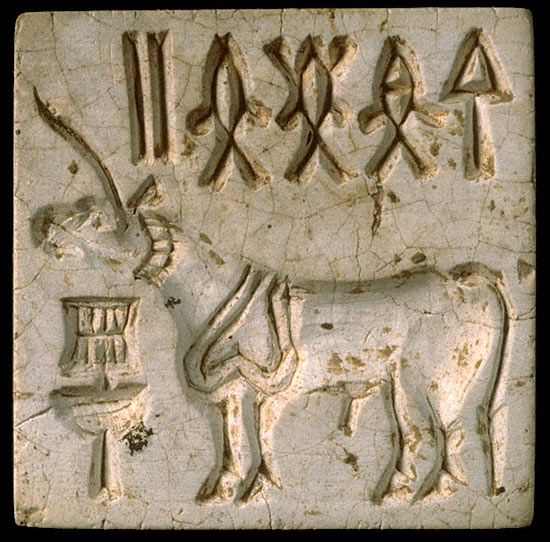
Unicorn seal from Harappa, c. 2200 BC. Image: Harappa.com.

This project explores the history of medieval information technology by modelling writing as code. But what, exactly, does writing encode? Answers to this question are complex, significant, and richly productive.
what does writing encode?

The easy answer is that writing encodes information. The earliest forms of writing seem to have been used for accounting. However, there is some debate among historians of writing over whether visual semiotic systems that encode non-linguistic information should be considered ‘writing’. This is perhaps a semantic quibble, but it underlines a very important historical development: at some point, every writing system commonly used today was adapted for linguistic information. Since the most commonly and frequently used method that humans use to create, store, transmit, and process information is verbal – that is, humanly usable information is mostly linguistic – this tight linkage of writing and language became overwhelmingly powerful. It is easy to think of writing only as a representation of language, and of spoken language in particular.

Apr 6, 2015

The marvels of Hesdin

Now that April 1 is well past, it’s probably safe to try this little diversion about something weird and wacky from the Middle Ages: the entertainment mechanisms of Hesdin Castle.

Image: Rob Zeldenrust.
[Image, left: detail of Wedding Party at the Park of Hesdin, 16th-century copy of a lost original possibly by Jan van Eyck.]

Hesdin was built by Count Robert II of Artois (1250-1302). It was, sadly, demolished in the 16th century. Our fullest account of the contraptions installed in the castle and its park comes from the accounts of the dukes of Burgundy, who spent a greal deal of money on the renovation and upkeep of Hesdin. In particular, an entry from the accounts of 1432 describes in detail the mechanisms on which Duke Philip the Good of Burgundy spent 1,000 livres to renovate or install, paid out to valet-de-chambre and painter Colard le Voleur:

Mar 25, 2015

Reading twitchily, then and now

A physician reading. Image: US National Library of Medicine.
[Right: Historiated initial from the Articella. Bethesda, United States National Library of Medicine, MS of the Articella, fol. 19v. Oxford, 13th century.]

After expressing all kinds of scepticism in two previous posts (here and here) about Paul Saenger’s arguments concerning word separation, I think it only fair to lay out an aspect of reading with spaces that, according to more recent studies on the neuropsychology of reading, Saenger got (mostly) right. It has been empirically demonstrated that word separation by space does speed up reading for skilled adult readers. Furthermore, it does so in a range of writing systems, including writing systems that use scriptio continua, that is, those that do not conventionally separate words by space, such as Chinese or Thai. In other words, even when skilled readers of such scripts are confronted with unconventionally word-separated text, they process the text more quickly.

Mar 7, 2015

10 best from the Macclesfield Psalter

And now a post from Medieval Codes team member Courtney Tuck:

The Macclesfield Psalter is a manuscript with very unusual marginal illustration. The manuscript was created around 1330 in the region of East Anglia, Britain. It is currently housed in the Fitzwilliam Museum in Cambridge. The absurdity, grotesques, anthropomorphized animals and scatological humour in this manuscript’s marginalia are all as surprising as they are enjoyable. It is an interesting look at what was funny and amusing to the medieval reader of this region. The role of marginal illustration has been identified by scholars as being a mnemonic device, which was especially helpful before pagination was developed. Odd and memorable images, often having nothing to do with the actual text on the page, help one differentiate and remember the location of pages and passages.

For your enjoyment, I have compiled my personal top 10 most memorable marginal illustrations from the Macclesfield Psalter. Some of the more rude images were left out of the list, though they are still worth finding and giggling to oneself over….

10 – This owl has no idea what’s about to hit him. Or perhaps he does….? This scene seems almost cartoonish. The owl’s expression reminds me of a Warner Brothers cartoon. That moment when Wiley E. Coyote has gone off the cliff, but not fallen, he looks at the audience and gives a knowing look or perhaps a small wave before he falls. Poor owl!

Feb 20, 2015

Reading with spaces in Anglo-Saxon England

Boisil teaching Cuthbert. Image: British Library.
In the Life of St Cuthbert composed by Bede c 721, there is an episode in which Cuthbert asks his mentor, the saintly Boisil, to recommend a book that can be read in one week. Boisil suggests the Gospel of John, and provides a copy consisting of seven quires (codex habens quaterniones septem), which the two of them read together, one quire a day, until Boisil, as he has predicted, dies at the end of the seven days.

[Image: London, British Library MS Yates Thompson 26, fol. 21r, detail. Durham, late 12th century. Miniature from Bede's Vita Sancti Cuthberti.]

Whether or not this story can be entirely accepted as historical fact is perhaps doubtful; it occurs in a text that is concerned more with promoting the saintliness of Cuthbert than with what we might consider historical accuracy, and I suspect that Bede wants us to see a parallel between the seven days of reading, after which Boisil goes to his eternal rest, and the biblical seven days of creation, at the end of which God rested. As well, we might wonder at Boisil’s recommendation of the Gospel of John as a book it would take a week to read; in a modern English translation this text is about the length of a longish short story, and a skilled modern reader could easily read through it in an hour or two. Each quire (quaternion) in Boisil’s manuscript would be the equivalent of 16 pages, but Boisil expected Cuthbert to take a day to read each quire. What is even more striking is that Bede considers a week’s time to be a quick read of the Gospel of John; he implies that ordinarily it would have taken longer. Medieval people must have been slow readers.

Well, yes, by evidence such as this, medieval people were slow readers by our standards. But to discover why, we have to consider the evidence more carefully.

Feb 11, 2015

Spaces and silence

 London, British Library MS Harley 1775 (Harley Gospels), fol. 373v. John 1.14 per cola et commata, in scriptio continua.

In 1997, Paul Saenger pulled off a feat I admire: he published a lengthy, detailed, and learned book entirely about the little spaces between words. Space Between Words is still the place to go for a painstaking account of the history of word separation in the medieval West, from the first texts separated by space in late 7th-century Ireland to the eventual adoption of canonical word separation for all Latin and vernacular texts in western Europe by the end of the Middle Ages. Although early Greek and Roman texts separated words by interpuncts (little dots), later Latin texts were written in scriptio continua (or scriptura continua): a continuous string of characters without spaces to mark word boundaries. Beginning in the late 7th century, Irish scribes introduced spaces at irregular intervals to create what Saenger calls ‘aerated’ text , and, by the 11th century, scribes in northern Europe were separating Latin text ‘canonically’ – that is, the way we do now in standard written English, with spaces between words. This history can be verified by checking the manuscripts that Saenger cites as examples, if anyone has the gumption to follow up all the items in Saenger’s impressive nineteen-page list. I, for one, am quite happy to take Saenger’s word for it.

London, British Library MS Additional 89000 (St Cuthbert Gospel), fol. 1v. John 1.14 with canonical word separation.

More controversial, however, is the argument that Saenger builds on top of this history, an argument encapsulated in the subtitle of the book: The Origins of Silent Reading. Briefly, Saenger claims that word separation was, in the Middle Ages, ‘the crucial element in the change to silent reading’. Silent reading, in turn, facilitated ‘reference reading’ – the technique of scanning texts quickly to find specific items of information – and contributed to the shift from the idea of reading as a public activity, as it was in the ancient world, to the idea of reading as a private activity, as it is in the modern world. I am, of course, greatly oversimplifying Saenger’s ideas here, but if you want all the details, you should read the book.

Saenger’s thesis may be attractive, not least the argument that a seemingly innocuous and subtle encoding practice – introducing a bit of white space between words in written texts – has had such far-reaching technological and social effects. But is there a straightforward causal relationship between word separation and silent reading? I’m not so sure.

Jan 23, 2015

Information architecture: Texts as buildings

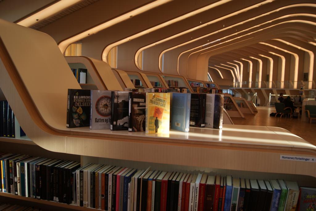
Vennesla Library, Norway. Image: NAPLE library buildings database.
The concept of information architecture is not new, although the modern use of the term, and the profession associated with it, dates from the 1970s. It is most often applied today to website design; the Oxford English Dictionary defines it as a computing term: ‘the manner in which information is stored, organized, or disseminated, (now) esp. online or on a web site’  (s.v. information, C2, information architecture).

Information architecture is, of course, a metaphor; one does not build websites in the same way in which one constructs buildings. In this case, the metaphor is a model: it suggests certain ways of thinking about the abstraction that we call ‘information’. The modern phrase was coined to convey the idea that, just as buildings are designed for storage, movement, and functionality, so analogous design principles apply to the ways we might store, navigate, and use information.

Jan 9, 2015

Don't blame the Vikings

Ruins of Lindisfarne Priory. Image: English Heritage.
In the year 793, Vikings raided the monastic community at Lindisfarne, in the Northumbrian kingdom of Bernicia. It was the ominous beginning to a series of assaults on England; the following year, Vikings pillaged the monastery at Jarrow. It is unlikely that the Vikings were making deliberate attacks on Anglo-Saxon scholarship by targeting these places of learning; monasteries were known to be full of valuable objects, and monks were probably not expected to be formidable opponents. The raiders were interested in loot and, later, in land; over the next hundred years, the once-powerful Anglo-Saxon kingdoms of Northumbria, East Anglia, and Mercia crumbled before increasingly extensive Viking incursions. The Scandinavian takeover of England was not significantly halted until the West Saxon king Alfred, driven into a hideout in the marshes of Somerset, somehow managed to organise the remnants of the local Anglo-Saxon militia and to defeat the Danish forces at the battle of Edington in 878.